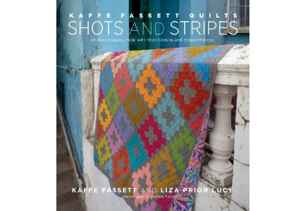
I received an advance copy of the book, Kaffe Fassett Quilts Shots and Stripes written by Kaffe Fassett and Liza Prior Lucy. Their publicist (thank you!) allowed me to ask the authors a few questions and I’m going to share the answers with you at the end of this post. I admit, I was excited and just a bit star struck with this opportunity. Kaffe Fassett is a superstar in the world of textiles. He’s known for his vibrant colors in yarns and fabrics. I’ve collected his florals and shots for years. His designs are reliably in my “this is too pretty to cut” category. When I do use them, I’m pleased with the richness they bring to my quilts.
Here’s more about the authors from the press release:
Kaffe Fassett is widely acknowledged as a visionary in the use of color and was the first living textile designer to have a one-person show at the Victoria and Albert Museum in London. He is the fabric designer for Rowan Patchwork and Quilting, the primary knitwear designer for Rowan Yarns, and the author of sixteen books, including STC Craft’s Simple Shapes Spectacular Quilts, and Kaffe Fassett: Dreaming in Color, his autobiography. He lives in London.
Liza Prior Lucy is an expert quilt maker and the owner of Glorious Color (gloriouscolor.com), a source for fabrics designed by Kaffe Fassett and friends. She works with Fassett on his fabric lines, his books, and his appearances in the United States.
Here’s more about the book:
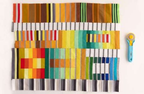
This project book includes 24 new designs using solid shot cottons and striped fabrics, rather than the lavish florals with which Fassett is so often identified. The stunning quilts range from full-size bed and wall quilts to smaller pieces that can be completed more quickly, like throws, table runners, and pillows. The designs inside Shots and Stripes were inspired by Fassett’s international travels and the ethnic textiles he has encountered, including Japanese indigo quilts, African weaves, Pakistani kanthas, and suzanis from the Caucasus. Each project includes a list of the fabrics used, as well as suggestions for alternate colorways.
Q & A with Kaffe Fassett and Liza Prior Lucy
I’d like to thank Kaffe and Liza for taking the time to answer my questions.
How do you pronounce Kaffe Fassett’s name?
Liza: His name rhymes with Safe Asset.
I’ve always wondered why when most people make an Amish/Mennonite-style quilt with modern solids, it never delivers the visual delight of a historical Amish/Mennonite quilt. Kaffe, you explain why this is the case in this book, and I agree. Liza, do you agree with this observation? Do either of you collect antique Amish / Mennonite-style quilts?
Kaffe: I don’t have an Amish collection, either. I collect scrap quilts with small blocks, obsessively pieced, for the most part. I do love to see any old or vintage quilts especially scrappy ones.
Liza: I agree that many very well dyed modern solid fabrics don’t do justice to doing a reproduction of antique Amish quilts. There are two reasons for this. First of all, many of the old quilts were made from used clothing and often the same color throughout the quilt looks varied because of this. Second, many were made of wool and the visual impact of that fiber is a bit different from cotton. I feel that the Shot Cotton is quite good for getting that depth of color seen in wool and it has enough color variation depending on how it is cut, that it imitates the scrappy quality of the old quilts quite well. I live in Pennsylvania about an hour’s drive from Amish country. I wish I could collect the antique Amish quilts since I am a huge fan but the ones I would want to have are beyond my reach. I do go and visit that area a few times a year and have seen many exhibits of the old ones. Unfortunately, many of the quilts made for the “English” (non Amish) these days are fluffy white confections to be used as bed spreads and they leave me cold.
Kaffe, I consider you a color master and I appreciate that you share your design process (color and form) with us in this book. Is there anything about your process you’ve never shared with the public and would like us to know? For example, I always heard from conventional quilters in guilds that if you want a successful quilt, always add some yellow. Liza, have you heard of this?
Kaffe: Writing about color is hard for me. I work with color in a purely instinctive way. So my thoughts on the matter don’t fall into ready-made sayings or rules to guide people who don’t feel they know. There is nothing to KNOW. Just play and use lots of tones to see how you like it. Respond. There is no WHY in the world of color for me. Liza’s answer is quite good. We are both contrary so I tell my audiences not to listen to a word I say.
Liza: I haven’t heard this wisdom but I emphatically disagree. I find yellow to be very attention-getting and the only time I use it is in abundance. Use just a bit here and there and for the most part, I think it would be too dominate and not play well with others. Of course, just saying that makes me wonder how I could use bits of yellow here and there in my next quilt and make it work. I am contrary that way.
I think the only thing we haven’t shared is that we both sing when designing our quilts. We do this quite badly.
Is the factory in India that once started making your shot cottons still making them?
Kaffe and Liza: The weaving has moved to a new village but it is still done in the same way.
I used Kaffe’s shot cottons in a quilt I made once for a school teacher (on behalf of her 5th grade students). I was afraid since the weave is looser in a shot cotton, that it might not wear the same as the 100% cotton quilting fabric, which I mixed with it for the top. My solution was to use a double layer of shot cotton in those areas. The book mentions the looser weave, but does not suggest you use a double layer in a quilt that is going to be washed a lot. Do you think the double layer was a good idea or totally unnecessary?
Kaffe: Liza it the technical one in the family so I go with what she has said.
Liza: Unnecessary, but thanks for using a lot of it :). I use the shots with prints all the time and don’t give it second thought. Patchwork is traditionally a “make-do” craft and I really don’t think about the various weights and textures when making a quilt.
Though the book focuses on stripes and shot solids, the backs of all the quilts in the book show off one of Kaffe’s 100% cotton prints. I was not aware that Kaffe started Rowan with stripes and shot cottons, I thought it was the other way around. Is there any other misconception about your work / career that you would like your fans to know?
Kaffe: I do the colorways for Philip Jacobs’ printed fabrics which he designs for the Kaffe Fassett Collective for Rowan.
Liza: The Stripes were first and Kaffe went to India for Oxfam to design them for Oxfam to make duvet covers and cushions and such. By coincidence, he brought the swatch card to show me on one of his trips to Pennsylvania to work on our first book. I thought that if they made the fabric the right weight we could try using them for patchwork. We convinced 3 friends to invest in the first 25 bolts so we could make 3 quilts! Oxfam never did make the bed linens and the quilters of the world embraced the fabric with enthusiasm.
Besides your own fabric lines, do you have a favorite fabric designer? One whose work excites you when you view it?
Kaffe: Martha Negley who designs for Free Spirit is the best colorist in the printed fabric world in my humble opinion.
Liza: I am a big fan of Keiko Goke of Japan and Marcia Derse from the US. I love reproduction fabrics from the Arts and Crafts period.
Who are some of your favorite bloggers, just for sheer inspiration, or just for fun?
Kaffe: I don’t use the computer but I have read and seen Yarnstorm and Material Obsession and both are brilliant influences on the world of the hand.
Liza: Jane Brocket of Yarnstorm, Kathy Doughty of Material Obsession, Jude Hill of Spirit Cloth, Sandy Donabed of Waiting for the Muse, and True Up are my faves.
***Stay tuned Craft Gossip readers, I’ll announce a giveaway for a copy of the book in a later post.***
Save
I’m so happy I found Kaffe Fassett and his wonderful work !! His fearless use of colour is fascinating . My first ever Kaffe fabrics have arrived and my copy of one of his books and I’m delighted. I love shot cotton and handloom stripes so this new book is next on my ‘must have’ list AND the biggest bonus yet is: I live in India and have access to all this fabric ! Happy Times !
Love the richness of the fabrics and am anticipating how great the finished projects will look in the new book.
What I didn’t know til the review was that singing is involved in the design process. I thought that was a personal quirk of my own.
Thanks for the review.
I’m a longtime Kaffe Fassett fan and have eagerly been anticipating this new book! I read his books like cookbooks – the interplay of color and design is inspirational and uplifting, even if I don’t make a thing!
Very interesting to hear that Kaffe doesn’t have a recipe for using color, as an artist I have always loved the color in his work. I first came into contact with his sweaters years ago and love the fabric for clothes and stuff around the house.
Loved the article…singing while designing and quilting-who knew. I’m intrigued by the shot fabric and may have to use it myself.
I learned that the authors both sing, and badly at that, according to Liza Prior Lucy, while making the quilts. They both seem like they were a good interview for you.